5 Tips for Designing a Tradeshow Display
A successful trade show requires careful planning and thought. You want to make important professional connections while you attract new customers.
There’s lots of competition. You need your booth to stand out from the crowd. You want your display to be eye-catching and different. But you also want your message to be clear and easily understood. Deciding on a creative booth design and trade show graphics can be a bit overwhelming. But we have some ideas.
Here are 5 tips for designing a beautiful trade show display.
Make an Impact
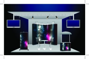
When you are thinking of graphics for your display, remember all the visitors who will be walking by your booth. As they take a look at your booth, you want your display to make an impact.
There will be lots of competition for their attention, so capturing their interest is crucial. Your display needs to offer a quick picture of your unique brand, and it needs to be highly visible at a distance as well.
If you can’t capture the visitors’ attention, they are on to the next booth. So you must make a quick, lasting impression. Think about a billboard on the freeway. The intention is to make an impact in a quick moment.
You should approach your trade show design in the same way. If you have too many words or images or if it’s not easily seen, the message is lost.
Keep It Simple
You may be tempted to try to show everything about your business in your design, but you shouldn’t do this. Less is more in this situation. If your design is too busy, your message won’t stand out. Instead of cramming too much information in your display, think about the most specific message you wish to relay to your audience.
In a moment, you want to be recognized and capture the visitors’ attention. Filling every inch with graphics is confusing to the eye and will make your booth look cluttered and less effective. Some people think that using all capital letters in their trade show graphics will attract an audience. But using a mix of capital and lower case letters is best.
It looks more natural, and it’s easier to read at a distance. Make sure your design reflects a consistent theme among your banners, posters, and other materials. This reflects professionalism. If you have sent out emails or mailers ahead, those graphics should be consistent as well. Brand awareness and familiarity help you stand out from the rest.
Include White Space
Don’t forget to include plenty of white space in your trade show graphics. What’s not on your display is almost as important as what’s on it. A good display should include plenty of white space. This gives your display an uncluttered look allowing your audience to read your information and comprehend your intended message.
Your design should have around 40% of empty space. You have only a moment to capture your visitor’s attention. Don’t waste that chance by cluttering your display. Respect the empty space.
A successful display isn’t one with overloaded bells and whistles. Instead, it’s the one with a clean design that captures people’s attention.
Know Your Audience
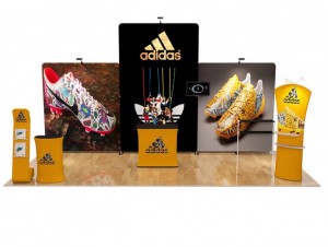
Make sure you have researched the area where the trade show is held. You want to know the demographics of the attendees and how you can market to this particular audience. You want your brand to speak directly to this audience and help draw traffic to your display. It’s also necessary to humanize your display.
Having a social media marketing strategy is a necessity. This is a great way to advertise your booth and engage with people who will be attending the event. If attendees are from out of the area, you can engage them with helpful information about the area or even great places to have dinner or drinks.
You want your display to be approachable and not intimidating to your visitors. Have options like pamphlets, flyers, or video to appeal to different personalities. Some people will want to engage with you, so make sure there is friendly staff available and ready to answer questions and discuss your product.
People love free things, and they love to win something. Contests and promotions can help attract people to your display as well. But if you are doing this, require visitors to give their information and email address. This is a great way to get contact information while engaging your visitors.
Booth Location and Architecture
Location matters, of course. Some venues offer prime display locations for an extra charge. These usually sell out pretty fast, and some have prime spots grandfathered in, so you have to plan ahead. And this can be an important negotiating point for your contract.
If your plan is to attend the trade show for years to come, a prime location could be offered in return. In addition to the location, you must consider your architecture. If possible, your imagery should complement the existing architecture of the venue. This creates a harmonious effect.
After all, the goal is to leave your audience with a positive and memorable impression of your business. Your graphics and text should be appropriately scaled, and your message should be simple and impactful.
Trade Show Graphics: Hire the Best
Thinking about trade show graphics can be overwhelming especially when you are busy running your business. There’s a lot to consider. You want your trade show display to appear well thought out and structured. And you want to leave a lasting impression on your visitors.
You need a team who understands design and can help you create a display that will wow your audience. It’s an investment that could result in a great return for your business.
If you are new to the idea of a trade show display or if you are interested in a new design for your display, we can help. Contact us today or email us at [email protected] and get a free no obligation and virtual mock-up


